SportsBiz Valuation Dashboard Redesign

UX Strategy, User Interface Design
Project Overview
SportsBiz needed a review and redesign their Valuation Assessment screens, which provide brands and sponsors with insights into the performance of ad campaigns during live sports broadcasts. Their existing dashboard displayed basic numbers but lacked depth, hierarchy, and interactivity — making it difficult for users to quickly extract actionable takeaways.
My Contributions
UX Strategy
Competitive Research
User Interface Design
After reviewing the original layouts, I identified five main opportunities for improvement:

• Clarify the Navigation – The existing navigation required too many clicks to reach key details, and related items weren’t grouped logically.  
• Reduce Clicks to Information – To see performance metrics across all categories required over 20 clicks.  
• Simplify Background Contrast – The heavy blue background limited hierarchy and made it harder to scan data.  
• Add Data Visualization – Raw numbers lacked context; charts and graphs could reveal trends and comparisons.  
• Add Value Ranking – A scoring system could help contextualize whether a performance metric was “good” or “bad.”
Opportunities identified
Redesign solutions
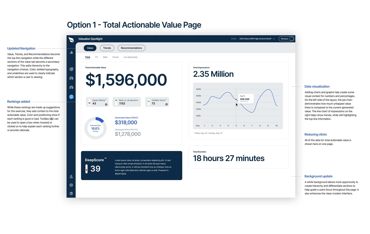
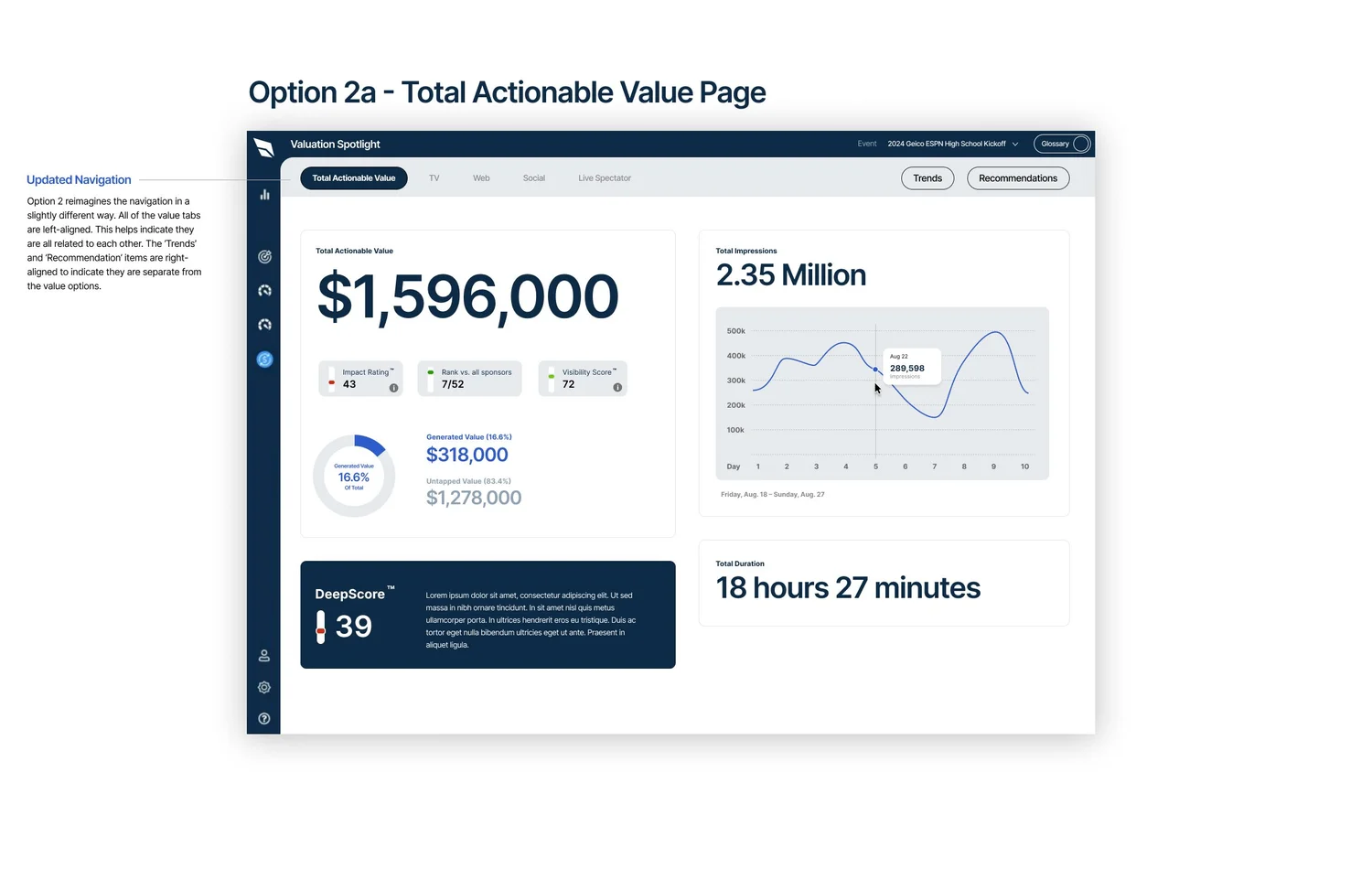
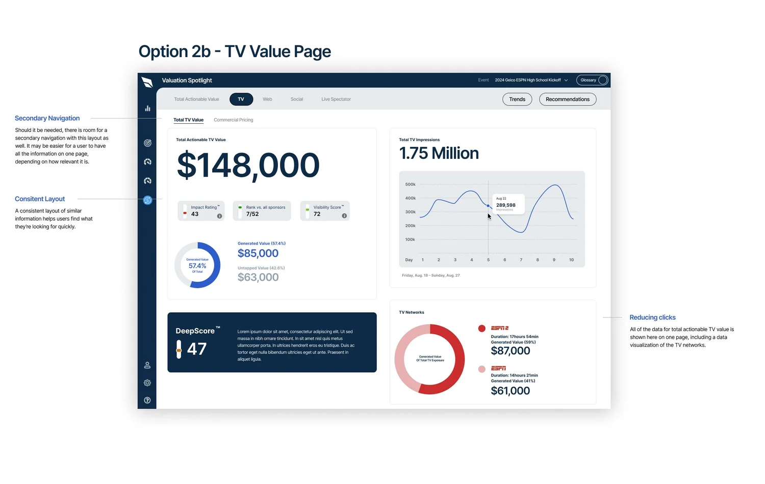
• Updated Navigation: Top-level navigation now includes “Value,” “Trends,” and “Recommendations,” while category-specific navigation (TV, Web, Social, Live Spectator) sits just below.  
• All Metrics on One Page: Each category page now shows dollar value, impressions, duration, and DeepScore in one view. This reduced ~20 clicks to just 4.  
• Data Visualization: A pie chart highlights generated vs. untapped value, while line graphs display impression trends.  
• Value Rankings: Impact rating, sponsor rank, and visibility score give users context at a glance.  
• Clean Background: White background improves scan-ability and visual hierarchy.